Designing a scalable design system for enterprise operational platforms
Summary
Evoke develops several internal operational platforms used across departments such as HR, compliance, and business operations. These tools were built using OutSystems, a low-code platform that enables rapid enterprise application development.
As the number of internal products increased, UI patterns and interaction behaviors began to diverge across teams. Components were being recreated in different ways, naming conventions were inconsistent, and visual standards were loosely defined.
To address this, I designed and implemented a Design System tailored specifically for OutSystems, translating existing brand assets into a structured system inside Figma, and aligning it with real engineering constraints.
The result was a shared design foundation that improved consistency, reduced duplication, and made it easier to build and maintain complex internal tools.
Timeline: 2025
Context
Internal platforms at Evoke support complex workflows such as compliance case review, hiring approvals, operational dashboards, and internal process automation.
Although OutSystems enabled fast development, there was no structured design layer supporting it. Each team was interpreting UI patterns differently, leading to inconsistencies in behavior, layout, and validation logic.
Additionally, brand assets such as colors and typography existed, but were not systematized or consistently applied across products.
My Role
Senior Product Designer responsible for designing and structuring the design system from the ground up.
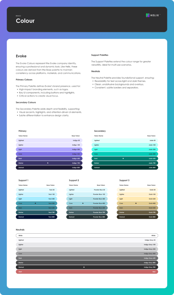
I started by auditing existing tools and identifying inconsistencies in components, naming, and interaction patterns. From there, I translated existing brand guidelines into a structured system inside Figma, defining color tokens, typography scales, and spacing rules using clear and consistent naming conventions.
A key part of the work was ensuring compatibility with OutSystems. Instead of designing abstract components, I created UI elements that could realistically map to the platform’s widget structure, reducing the gap between design and implementation.
I also organized the entire system into a structured Figma file, including foundations, components, patterns, and documentation with usage guidelines and real examples.
The Problem
Without a design system, internal platforms suffered from inconsistent UI behavior, duplicated components, and unclear interaction patterns.
Similar elements behaved differently across products, validation feedback was inconsistent, and engineers often needed to recreate components from scratch. As more tools were developed, maintaining consistency became increasingly difficult.
Approach
Instead of creating a theoretical UI kit, the design system was built iteratively alongside real product needs.
I focused on structuring the system in a way that balanced consistency, usability, and engineering feasibility. Existing UI patterns were analyzed and consolidated into reusable components, while naming conventions and tokens were standardized to create a shared language between design and development.
The system was designed directly in Figma, with a clear architecture and documentation to support adoption.
Key Improvements
The design system introduced a consistent structure for colors, typography, spacing, and layout by converting existing brand assets into semantic tokens with standardized naming.
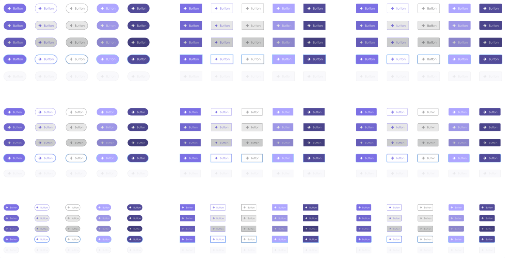
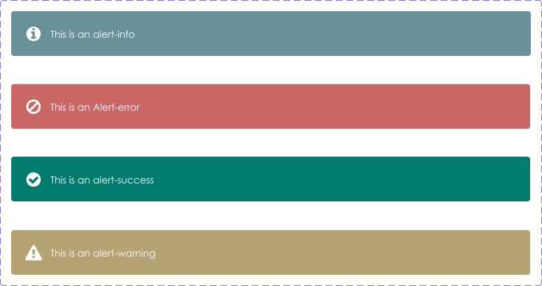
Reusable components were created based on real use cases, including forms, dropdowns, data tables, and workflow elements. Each component included defined states such as default, focus, error, disabled, and loading, ensuring predictable behavior across applications.
Interaction patterns were standardized for validation, feedback, and system messaging, improving clarity in complex workflows.
Because many tools relied on multi-step processes, I also structured workflow patterns for approvals, dashboards, and status tracking, helping users better understand progress and next actions.
Design System Architecture
The system was structured in Figma as:
Foundations → Tokens → Components → Patterns → Workflows
This structure allowed the system to scale while remaining organized and easy to maintain.
disabled
loading
Token-based foundations
To ensure scalability, the system used semantic design tokens for:
- color roles
- spacing
- typography hierarchy
- elevation and layering
Using tokens allowed components to remain consistent across products while still supporting future evolution.
Engineering Collaboration
A critical part of the project was aligning design decisions with OutSystems constraints.
I worked closely with engineers to map Figma components to platform widgets, validate feasible interaction patterns, and ensure layouts followed grid and structural limitations.
This reduced rework and made implementation more predictable.
Adoption
Adoption was driven through practical usage rather than enforcement.
By building components based on real workflows and supporting engineers during implementation, the system gradually became the default approach for new internal tools.
Maintenance
The design system was treated as a living product.
It evolved through real product needs, feedback from engineers, and continuous refinement of components and patterns based on usage.
Outcomes
The design system established a consistent foundation across internal platforms, reducing UI inconsistencies and duplication.
It improved collaboration between design and engineering, accelerated delivery of new features, and made complex workflows easier to understand and maintain.
What this demonstrates
This project reflects my ability to take an unstructured design environment and turn it into a scalable system aligned with both business and engineering needs.
It also shows my approach to working with real constraints, structuring complexity, and building systems that are practical, not theoretical.